Since the moment I first touched email HTML, I learned that nothing is what it seems! You create a beautiful email in Customer Insights - Journeys and feel amazed by your own creativity. But the moment you hit send, you receive a thousand different versions of the very thing you just created. Outlook doesn’t support custom fonts, Gmail cuts off your email after a certain size, and the list goes on.
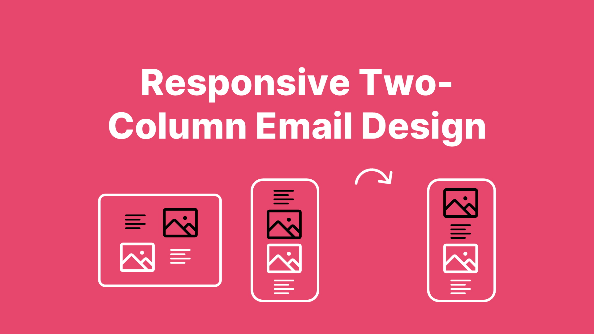
One of the things I hate the most is when a desktop two-column Z-pattern looks like this 👇:

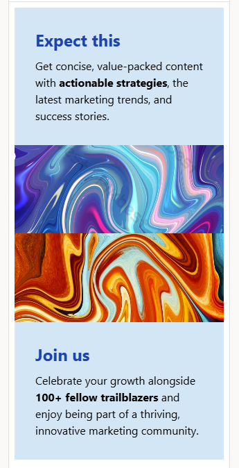
But the mobile version looks like this 👇:
😭😤👿
So let’s fix this! And trust me, this is a really short blog 😉
Step-by-Step Approach
Step 1 - Setting Up Your Desktop Version
In your email template, create Z-pattern two-column sections and add your images and text to the columns.
Step 2 - Adjusting the HTML
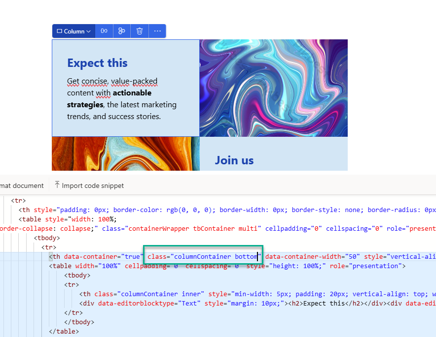
Thanks to the user-friendly email HTML editor, we can easily locate the HTML code for the columns. Open the HTML editor and click on the left column containing the text. In the first blue-highlighted td element, add the class bottom, as shown in the image below.
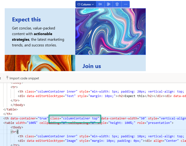
Next, select the right column containing the image. In the first blue-highlighted td element, add the class top, as shown below.
Step 3 - Adjusting the <style> Section
When you open the HTML of the email, you won’t see the final HTML and styling of the email. After you hit publish, Dynamics automatically adds extra lines of code for mobile responsiveness and Outlook compatibility. (This is why you need to copy the actual HTML code when measuring the carbon footprint of your email.)
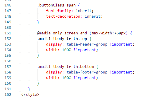
To enhance mobile responsiveness, we need to modify the media query. Add the following code before the closing </style> tag in your <style> section:
@media only screen and (max-width: 768px) {
    .multi tbody tr th.top {
        display: table-header-group !important;
        width: 100% !important;
    }

    .multi tbody tr th.bottom {
        display: table-footer-group !important;
        width: 100% !important;
    }
}
Your email HTML code should now look like this:
Step 4 - Test Your Work
Save your email and send yourself a test email or live test to review the mobile results.

🤓😁🤩
Step 5 - Create a Content Block
I highly recommend creating a content block for this section. This allows you to easily reuse them in your templates, with the HTML adjustments already in place.
Wrap-Up
If you’re using this two-column reversed (Z-pattern) section in your email templates, you now know how to make it look great on mobile devices too! This applies to all two-column sections, by the way, so if you use the 1/3 - 2/3 two-column section, you can apply the same technique! Good luck 🍀